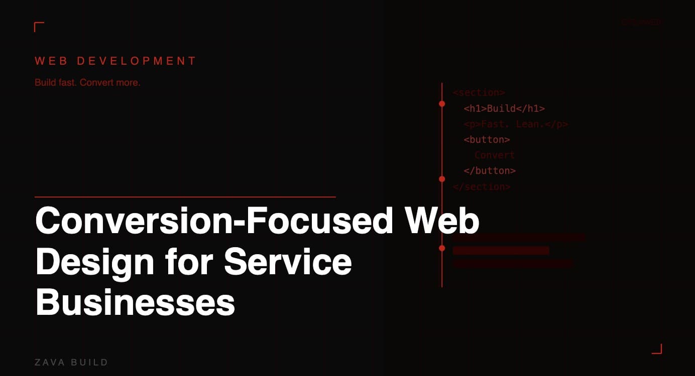
Conversion-Focused Web Design for Service Businesses
Introduction
Most service business websites share the same problem: they look professional enough, but they don't generate leads. Visitors land on the site, browse for a few seconds, and leave without picking up the phone or filling in a form. The design might be clean and the services clearly listed — but something is missing.
That something is intent. Conversion-focused web design is built from the ground up with a single goal in mind: turning visitors into enquiries. Every layout decision, every heading, every button placement is made with the end result — a booked job or a phone call — as the benchmark.
For UK service businesses — plumbers, electricians, landscapers, roofers, heating engineers — this approach is the difference between a website that costs money and one that makes it.
What Is Conversion-Focused Web Design?
Conversion-focused design is a methodology that prioritises user action over aesthetics. It combines psychology, UX principles, and data-driven layout decisions to guide visitors toward a specific outcome — usually a phone call, contact form submission, or quote request.
This doesn't mean sacrificing visual quality. The best-converting service websites are both attractive and strategically engineered. The key difference is that every visual and structural choice is justified by its contribution to conversion, not just its appearance.
The 5 Core Principles of High-Converting Service Websites
1. Clarity over cleverness
Your homepage needs to answer three questions within three seconds: What do you do? Where do you do it? How do I contact you? Clever taglines and vague brand language work against this. The most converting service sites lead with direct, benefit-driven headlines like "Emergency Plumber in Leeds — Available 24/7" rather than "Your Local Plumbing Solution."
2. One primary call to action per page
Every page should have a single, dominant CTA. For service businesses, that's almost always a phone number or a "Get a Free Quote" button. When you give visitors too many options, decision fatigue sets in and they choose none. Keep it simple: one primary action, repeated at logical intervals down the page.
3. Trust signals embedded throughout
Conversion rates drop sharply when visitors don't trust you. Embed trust signals consistently: accreditation logos (Gas Safe, NICEIC, Checkatrade), review stars with real quotes, years in business, and photos of your actual team. Place these near CTAs, not just on a separate "About" page.
4. Speed as a design requirement
A conversion-focused design isn't just about visuals — it includes performance. Pages that take more than 3 seconds to load lose a significant proportion of mobile visitors before they've seen a single word of your content. Design decisions — image weight, font loading, plugin count — directly affect load time and therefore conversion rate.
5. Mobile-first layout logic
More than 70% of local service searches happen on mobile. Your design must be built for the thumb-scroll experience first. Tap-friendly buttons, click-to-call phone numbers, short form fields, and a fast-loading mobile layout are non-negotiable.
Above-the-Fold Design: Your Most Valuable Real Estate
The section of your webpage visible before scrolling — the "above the fold" area — carries disproportionate weight in conversion. It should contain:
A clear headline stating what you do and where
A visible phone number (click-to-call on mobile)
A primary CTA button ("Get a Free Quote" or "Book Online")
A brief, credibility-building subheading (e.g., "Rated 4.9 stars by 200+ customers")
A strong hero image — ideally your team, van, or a finished job (not a stock photo)
If someone lands on your site and scrolls away without reading past the fold, your above-the-fold section failed. Test it by asking someone unfamiliar with your business to tell you what you do within 5 seconds of seeing the page. If they struggle, redesign it.
Designing Lead Generation Forms That Actually Get Filled
Contact forms are a major conversion bottleneck. Here's what works for service businesses:
Keep it short — Name, phone number, and a brief "What do you need?" field are usually enough to qualify a lead. Every additional field reduces completion rates.
Label the action, not the form — Use "Get My Free Quote" as the submit button, not "Submit" or "Send." The label should reinforce the benefit of completing the form.
Reduce friction on mobile — Use appropriate input types (tel for phone numbers, email for email addresses) so the right keyboard appears on mobile. Make fields large enough to tap accurately.
Add a trust micro-copy — A single line beneath the form like "We reply within 2 hours — no obligation" dramatically increases submission rates.
Colour, Contrast, and CTA Button Design
CTA buttons should stand out from everything else on the page. This means high contrast with the background, a colour that isn't used elsewhere in the design (so it signals "action"), and enough whitespace around it to breathe.
For service businesses, greens, oranges, and yellows tend to outperform blues and greys for primary CTAs — they're associated with action and urgency. That said, always test your specific audience. A/B testing button colour and copy is one of the highest-ROI optimisation activities available to service website owners.
Navigation Design: Guiding Visitors, Not Distracting Them
Complex navigation menus are a conversion killer. For a service business website, your nav should focus on the pages that matter: Home, Services (with sub-pages per service), About, Reviews, and Contact. That's it.
Drop-down mega-menus, excessive footer links, and side navigation all create distraction. Every navigation click that isn't towards a service page or contact page is a step away from conversion.
Social Proof Placement for Maximum Impact
Reviews and testimonials convert best when placed immediately before or after a CTA — not buried at the bottom of the page. Strategic placement includes:
A star rating and short quote directly beneath your homepage headline
Full testimonial blocks just above the contact form or quote button
Case studies or before/after photos on relevant service pages
A dedicated reviews page linked from the main navigation
The goal is to eliminate objections at the exact moment a visitor is deciding whether to act.
Measuring Conversion Rate and Improving Over Time
A conversion-focused website isn't finished at launch — it's a continuously improving lead generation asset. Set up:
Google Analytics 4 — Track goal completions (form submissions, phone clicks)
Heatmapping (Hotjar or Microsoft Clarity) — See where visitors click and where they stop scrolling
A/B testing — Test different headlines, CTAs, and layouts against each other
Call tracking — Attribute phone calls to specific pages and traffic sources
Even small improvements — increasing your conversion rate from 2% to 3% — can mean 50% more leads from the same traffic volume.
Conclusion
Conversion-focused web design isn't about making a pretty website — it's about making a website that works. For UK service businesses, that means prioritising clarity, trust, speed, and strategic CTA placement above everything else. Done right, your website becomes your most consistent, cost-effective lead generation channel.
Ready to turn your website into a lead-generating machine? ZavaBuild specialises in conversion-focused web design for UK service businesses. Book a free strategy session →
FAQ
What makes a service business website high-converting? Clear messaging, fast load times, visible trust signals, a single dominant CTA, and a mobile-first layout are the key pillars of conversion-focused design.
How do I know if my website is converting well? Set up goal tracking in Google Analytics 4. A healthy conversion rate for service business websites typically sits between 3–8% of all visitors submitting a form or clicking to call.
Should I redesign my whole website to improve conversions? Not necessarily. In many cases, targeted improvements to the homepage, above-the-fold section, and contact page deliver significant conversion gains without a full rebuild.

About the Author
Christopher Bell, Co-founder & CEO, Zava Build
Middlesbrough-based growth specialist helping UK service businesses generate consistent, qualified leads through integrated digital systems.
With over 5 years of experience, Christopher combines high-conversion web design, intent-driven SEO, and expert Google Business Profile optimisation to build scalable foundations that deliver real enquiries, not just traffic.