Call-to-Action Optimisation
Call-to-Action Optimisation: Button Design, Copy, and Placement That Drives Clicks
Introduction
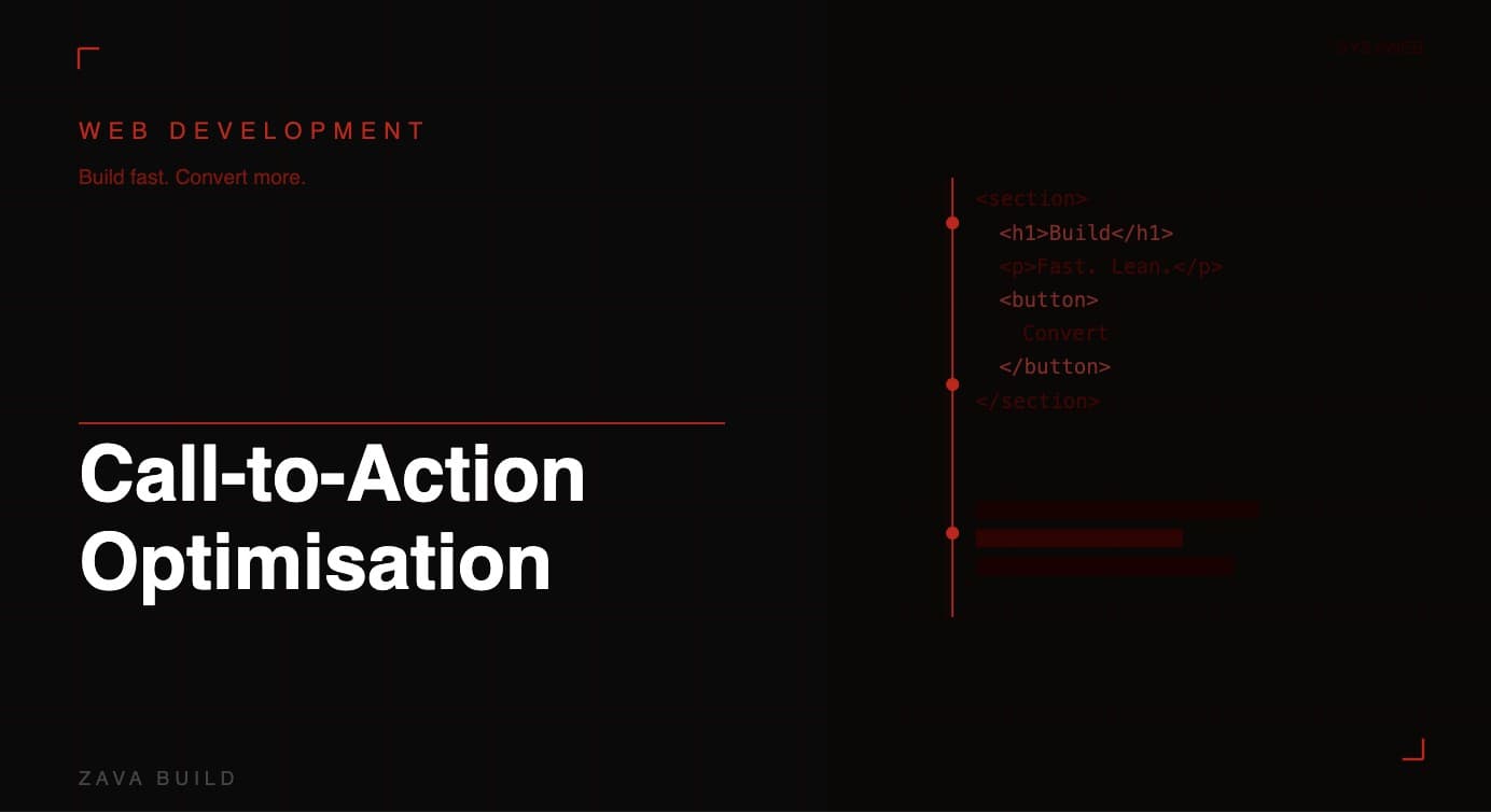
Every page on your service business website has a job: to move the visitor one step closer to contacting you. The call-to-action (CTA) is the element that makes that happen. It's the button, link, or prompt that bridges the gap between a visitor browsing your content and a customer picking up the phone or filling in your quote form.
Yet CTA optimisation is consistently one of the most neglected areas of service business web design. Most websites have a CTA — but few have one that's properly engineered to convert. This guide covers the three levers of CTA performance: design, copy, and placement, with practical guidance specific to UK trade and service businesses.
Why CTA Optimisation Matters More Than You Think
A poorly optimised CTA doesn't just underperform — it actively wastes your other marketing efforts. If you've invested in SEO to drive traffic, or Google Ads to capture search intent, every visitor who arrives and leaves without acting is money lost.
Small improvements in CTA performance compound quickly. Moving from a 2% to a 3% conversion rate represents a 50% increase in leads from the same traffic. For a service business generating 1,000 monthly visitors, that's 10 more enquiries per month — without spending another penny on advertising.
CTA Design: Making Buttons Impossible to Miss
Colour and contrast
Your primary CTA button must stand out from the rest of your page. This means choosing a colour that contrasts sharply with your background and — critically — isn't used elsewhere on the page for non-CTA elements. If your brand palette is blue and grey, an orange or green CTA button stands out and signals "this is the action to take."
Avoid making CTAs the same colour as other page elements. If everything is the same colour, nothing draws the eye.
Size and proportion
CTA buttons should be comfortably large — big enough to read easily and (on mobile) large enough to tap without accidentally hitting adjacent elements. The minimum recommended touch target size is 44x44px for mobile. Desktop CTAs can be larger still: a wide button with generous padding makes a bolder visual statement.
Whitespace
Surround your CTA with whitespace — empty space that isolates the button and makes it the visual focal point. Cluttered CTAs surrounded by competing content get missed. Give them room to breathe.
Shape and style
Rounded corners on buttons consistently outperform sharp-edged rectangles in testing — they feel more approachable. Drop shadows and subtle depth effects can also increase perceived clickability. Keep the visual language consistent across all CTAs on your site.
CTA Copy: Words That Drive Action
The text inside your CTA button is often the most underinvested element of the entire page. Changing a single word on a CTA has been shown to produce 10–30% conversion lifts — that's the power of copy.
Lead with the benefit, not the action
"Get a Free Quote" outperforms "Submit" or "Contact Us" because it tells the visitor what they'll receive, not what they have to do. Frame your CTAs around the visitor's desired outcome:
"Get My Free Quote" — personalised, action-oriented
"Book a Same-Day Visit" — specific, urgency-driven
"See Our Availability" — low-commitment, curiosity-driven
"Call Now — We're Available 24/7" — urgency with trust
Avoid vague, passive CTA copy: "Click Here," "Learn More," "Submit," or "Send" are missed opportunities to reinforce your value proposition.
Use first-person language where possible
"Get My Free Quote" converts better than "Get Your Free Quote" — the slight personalisation of first-person framing has repeatedly outperformed second-person alternatives in A/B tests. It's a small change that costs nothing to implement.
Create appropriate urgency
For emergency services, urgency language is entirely authentic: "Call Now — Emergency Response Available" or "Book Today — Limited Appointments This Week." Don't manufacture false urgency, but do communicate real availability constraints or time-sensitive offers when they genuinely exist.
CTA Placement: Where on the Page You Put It
Above the fold — always
Every service page should have a CTA visible before the visitor scrolls. For most service businesses, this means a phone number in the header (clickable on mobile) and a quote/booking button in the hero section. Visitors should never have to scroll to find a way to contact you.
After key content blocks
Place CTAs at logical decision points throughout the page — after a list of services, after a testimonials section, after a pricing block. These are the moments when a visitor has absorbed information and may be ready to act. Don't make them hunt for a contact method.
Sticky header with phone number
A sticky (fixed-position) header that stays visible as users scroll, containing your phone number and a CTA button, ensures the conversion path is always accessible. This is particularly effective on mobile where users may scroll a long way through content before deciding to call.
Exit-intent or timed prompts
For websites with longer content pages, a timed popup or scroll-triggered CTA (appearing when a user has scrolled 70% down the page) can re-engage visitors who are about to leave without acting. Use these sparingly and make them dismissible — aggressive popups damage user experience.
At the end of every page
End every service page with a clear, contextual CTA that relates to the content above it. A page about boiler servicing should end with "Book Your Annual Boiler Service Today" — not a generic "Contact Us."
Primary vs. Secondary CTAs
Not every visitor is ready to commit to a quote or call. Having a secondary CTA — a lower-commitment option alongside your primary action — can capture visitors who need more convincing:
Primary: "Get a Free Quote" | Secondary: "See Our Recent Projects"
Primary: "Call Now" | Secondary: "Send Us a Message"
Primary: "Book Online" | Secondary: "Read Our Reviews"
The secondary CTA should be visually subordinate — smaller, less prominent, or a text link rather than a button — so it doesn't compete with the primary action.
Testing CTAs: How to Know What Works
The only way to know definitively which CTA design, copy, and placement works best for your specific audience is to test it. Tools like Google Optimize, VWO, or even manual split testing using heatmaps can provide data:
Heatmaps (Hotjar, Microsoft Clarity) — show where visitors click most frequently and where they stop scrolling
A/B testing — serve different CTA variants to different visitor segments and compare conversion rates
Session recordings — watch real visitor sessions to see how they interact with CTAs
Prioritise tests by potential impact. Start with CTA copy (lowest effort, often highest impact) before moving to placement and design changes.
Conclusion
CTA optimisation is one of the highest-return improvements available to service business websites. Design buttons that stand out, write copy that communicates benefit and urgency, and place CTAs at every logical decision point throughout the page. Then test, measure, and improve continuously.
A well-optimised CTA strategy can increase your lead volume by 30–50% from existing traffic — without changing a single other element of your site.
Want your CTA strategy professionally reviewed and optimised? Zava Build designs conversion-focused websites for UK service businesses. Book a free strategy session →

About the Author
Christopher Bell, Co-founder & CEO, Zava Build
Middlesbrough-based growth specialist helping UK service businesses generate consistent, qualified leads through integrated digital systems.
With over 5 years of experience, Christopher combines high-conversion web design, intent-driven SEO, and expert Google Business Profile optimisation to build scalable foundations that deliver real enquiries, not just traffic.